doordash

DoorDash Marketing Campaigns

Analyzing DoorDash Marketing Campaigns with Microsoft Excel: Insights and Learnings

• MS Excel

Introduction

I can count the number of times I have used an online food delivery service to assist with food delivery in the nearly three decades that I have lived. Well, perhaps I was not always too busy to go out and get food by myself, or I just preferred homemade meals.

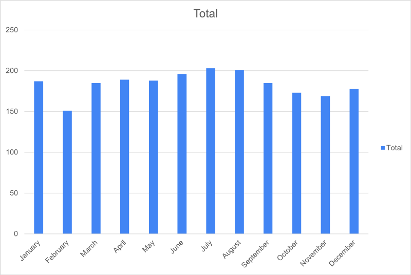
Nevertheless, the rate at which people all over the world utilize these food delivery companies has increased rapidly over the years. Research says that every week, delivery or takeout is ordered by 60% of consumers in the U.S., and 31% of them use third-party delivery services at least twice a week.

In this project, I will be pretending to be a data analyst hired by DoorDash and have been challenged to:


  • Study and understand the data

  • Look out for business opportunities & insights

  • Propose any data-driven action to optimize the results of the campaigns & generate value for the company.


The company has a goal to enhance its marketing efforts and is interested in identifying individuals who have made a purchase after being exposed to a marketing campaign. As a data analyst, that is where I come in. Ride with me!

Data

The dataset used in this analysis was provided by @DataAccelerator. Below is the data dictionary of our datasets with a description of the fields (columns):


  • Income: Customer’s Yearly Income

  • MntTotal: Total Amount Spent at Store by Customer

  • Kidhome: Number of Young Kids in Home

  • Teenhome: Number of Teenagers in Home

  • Recency: Number of Days Since Last Purchase

  • MntWines: Amount Spent on Purchasing Wine

  • MntFruits: Amount Spent on Purchasing Fruit

  • MntMeatProducts: Amount Spent on Purchasing Meat

  • MntFishProducts: Amount Spent on Purchasing Fish

  • MntSweetProducts: Amount Spent on Purchasing Sweet

  • MntGoldProds: Amount Spent on Purchasing Gold

  • NumDealsPuchased: Number of Purchases With Discount

  • NumWebPurchases: Number of Purchases Made Through Website

  • NumCatalogPurchases: Number of Purchases Made Through Catalogue

  • NumStorePurchases: Number of Purchases Made Through Physical Store

  • NumWebVisitsMonth: Number of Visits To Website in Last Month

  • AcceptedCmp1: Did The Customer Accept Offer in 1st Campaign

  • AccaptedCmp2: Did The Customer Accept Offer in 2nd Campaign

  • AcceptedCmp3: Did The Customer Accept Offer in 3rd Campaign

  • AcceptedCmp4: Did The Customer Accept Offer in 4th Campaign

  • AcceptedCmp5: Did The Customer Accept Offer in 5th Campaign

  • Complain: Has The Customer Complained In Last 2 Years

  • Age: Age of Cusotmer

  • Customer_Days: How Many Days Has Customer Been a Customer

  • marital_Divorced: Is Customer Divorced?

  • marital_married: Is Customer Married?

  • marital_Single: Is Customer Single?

  • Marital_Together: Is Customer Living With Someone?

  • Marital_Widow: Is Customer Divorced?

  • education_Basic: Is the customer’s highest education level high school?

  • education_Graduation: Is the customer’s highest education level undergraduate?

  • education_Master: Is the customer’s highest education level Master’s?

  • education_PHD: Is the customer’s highest education level a PhD

  • MntRegularProds: Total Amount Spent on regular products

  • DateJoined: The date the customer first became a customer

Analysis

I imported the data into Excel, cleaned, filtered, and sorted it to get rid of irrelevant information. After that, I did some basic statistical analysis using the functions count, countif, sum, max, min, and average to determine the data aggregation.


cleaned dataset in Excel

Some questions were to be addressed. They include:


  • Which campaign captured the most new customers?

  • From the most successful campaigns which new customers had children?

  • How old is the oldest customer?

  • What is the average amount spent by each customer in this segment?

  • What’s the total amount spent by customers (sum of the “MntTotal” column)?

  • Who is the most recently acquired customer?

  • Which months had a higher number of new customers?

  • Which campaign captured the most new customers?

  • Which month had the highest amount of captures by campaign?

  • Which product categories did age groups spend more money on?

…to mention a few.


advertising campaign

I also need to mention that advertising campaign #6 is successful with the audience it was aimed for. The average monthly expenditure for clients who purchased after campaign #6 is 64% greater than the spending of the typical customer, with sales jumping from $562.76 to $924.41. This represents a growth in sales of 133.3%.

Graphs

I plotted some graphs to better show the relationships between variables.


scatter plot showing the correlation between income vs total spent

A scatter plot was made to show how much money DoorDash customers made and how much they spent all together. Customers with more money tend to spend more on the platform, which is shown by a positive trend in the graph. But there were a few things that didn’t fit this pattern.

The regression line was also positive, indicating that income and spending are linked. The R-squared score was 0.6774, indicating how strongly the two variables are connected. This high R-squared figure indicates that there is a strong linear link between DoorDash customers’ earnings and spending. The difference in income explains 67.75% of the variance in spending.


To further my analysis, I plotted a histogram to group customers’ spending into different brackets. This will allow us to identify and target high-spending customers more effectively.


amount total histogram
Amount Total Histogram


Furthermore, I developed a pivot table in order to examine the months in which new members joined the group.


average new customers each month
It shows that an average of 184 new customers join each month.


Surprisingly, my analysis revealed an unconventional finding that the elderly age group of 66+ spent the most, despite being a smaller segment compared to the 36–50 and 51–65 age groups, which had higher total spending due to their larger number of consumers.


Spending per age group

This implies that there are untapped opportunities for targeting the elderly demographic, where even a few consumers in this age group can outspend the other age groups by almost $100. It is a compelling insight that challenges the conventional wisdom of targeting the larger, younger demographic and opens up new possibilities for businesses to explore.

Recommendations

  • Door Dash should continue to target clients with high incomes.

  • Intensify marketing in Nov and Dec.

  • On average, customers spend around $563 per month. However, marketing campaign #6 increased this amount to around $924, with the 36–50 age group showing the most significant increase. Therefore, DoorDash should prioritize targeting this age group. Additionally, there is a considerable opportunity to target the 24- demographic more directly.

Comments

Get In Touch

I'm determined to make businesses grow by transforming complicated data into meaningful insights. My only question is, will it be yours?

Contact Me